Interpreting Results
This chapter covers about how to interpret results from the experiment directory.
To interpret the results:
The ablator initially consolidates the metrics from all the trials into a unified combined dataframe.
Utilize the pandas dataframe to generate insightful plots depicting the relationship between metrics and parameters outlined in the configuration.
Importing Libraries.
from ablator.analysis.results import Results # for formatting results
from ablator import PlotAnalysis, Optim # for plotting

from ablator import ParallelConfig, ModelConfig, configclass # for configs

from pathlib import Path # for defining path
import pandas as pd # for reading dataframe
To create pandas dataframe
Define/Import all the custom configs used during the HPO (if using separate files for HPO and Analysis).
@configclass
class CustomModelConfig(ModelConfig):
  num_filter1: int
  num_filter2: int
  activation: str

@configclass
class CustomParallelConfig(ParallelConfig):
  model_config: CustomModelConfig
Generating results
The Results class is responsible for processing the results within all the trial directories.
The read_results() method from the Result class reads multiple results from the experiment directory using Ray for parallel processing. It returns all the combined metrics as a pandas DataFrame.
In this code snippet, a directory path is defined. Results are read from that directory. Subsequently, the results are saved to a CSV file.
directory_path = Path('./experiment_1901_aa90')

results = Results(config = CustomParallelConfig, experiment_dir=directory_path, use_ray=True)

df = results.read_results(config_type=CustomParallelConfig, experiment_dir=directory_path)

df.to_csv("results.csv", index=False)
Plotting graphs
The PlotAnalysis class is utilized for plotting graphs.
The responsibilities of the PlotAnalysis class include:
Generating plots between the provided metrics and parameters.
Mapping the output and attribute names to user provided names for better readability.
Storing the generated plots in the desired directory.
Transforming the dataset, so it gives the best validation accuracy for each trial.
df = (
        df.groupby("path")
        .apply(lambda x: x.sort_values("val_accuracy", na_position="first").iloc[-1])
        .reset_index(drop=True)
    )
Creating dictionaries that map the configuration parameters [categorical + numerical] to custom labels for plots.
The keys are the parameters inside the configuration file, and the values are the custom names.
Renaming attributes/metrics to custom names is optional. If not provided the names will be the default like “train_config.batch_size”.
categorical_name_remap = {
        "model_config.activation": "Activation",
    }
numerical_name_remap = {
        "model_config.num_filter1": "N. Filter 1",
        "model_config.num_filter2": "N. Filter 2",
        "train_config.optimizer_config.arguments.lr": "Learning Rate",
    }

attribute_name_remap = {**categorical_name_remap, **numerical_name_remap}
Finally, pass the following to the PlotAnalysis:
dataframe: Pandas dataframe.
cache: Whether to cache results.
optim_metrics: A dictionary mapping metric names to optimization directions.
numerical_attributes: List of all the numerical attributes plotted with respect to metrics.
categorical_attributes: List of all the categorical attributes plotted with respect to metrics.
analysis = PlotAnalysis(
        df,
        save_dir="./plots",
        cache=True,
        optim_metrics={"val_accuracy": Optim.max},
        numerical_attributes=list(numerical_name_remap.keys()),
        categorical_attributes=list(categorical_name_remap.keys()),
    )
The main_figures() method is responsible for generating graphs, specifically a violin plot for numerical attributes and a linear plot for categorical values.
To generate these plots, pass the mappings of metrics and attributes dictionary.
analysis.make_figures(
        metric_name_remap={
            "val_accuracy": "Validation Accuracy",
        },
        attribute_name_remap= attribute_name_remap
    )
Finally, the directory “plots” will contain all the plots of the HPO experiments
Analysis
Now, we can see the plot generated for our previous HPO tutorial.
Linearplots
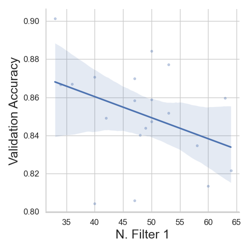
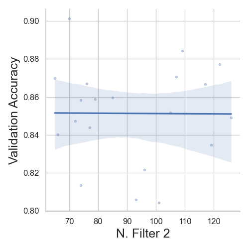
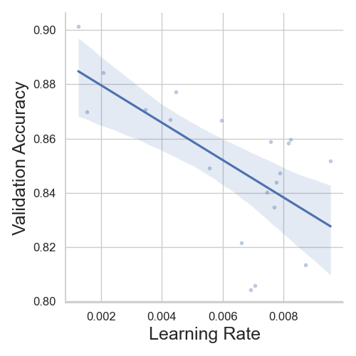
We can see that, with increase in learning rate, the model’s validation accuracy decreases. Similarly, with “N. Filter 1” decreases the model’s performance and the validation. Finally, the “N. Filter 2” hyperparameter does not affect the model’s accuracy.
Violinplots
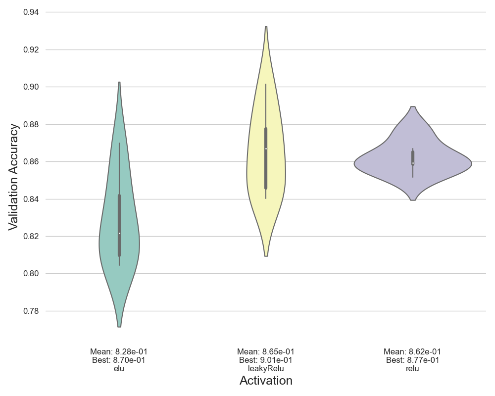
For activation functions, we can see “relu” and “leaky relu” perform better for this problem. Training with “elu” scores low accuracy on validation set. Overall, leaky-relu gave the highest accuracy for the experiment.
Conclusion
Thus, we have completed the analysis part of the tutorial. We saw the complete pipeline to use ablator to train models. This starts with prototyping models to analyzing the HPO results. We have significantly spend less time on writing boiler plate code while getting the benefits of parallel-training, storing metrics and analysis.